Nina: Mastering the Balance of Height and Roundness in Display Typography
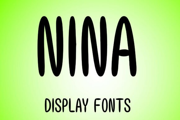
Nina represents a specific niche in modern typography where vertical elegance meets approachable geometry. As a display font that boasts a chic and stylish aesthetic, it is engineered to capture attention without sacrificing readability in headline applications. The design seamlessly blends significant height with soft roundness, creating a visual tension that feels both structured and playful. For creators, marketers, and small business owners, this typeface offers a distinct voice for branding, social media graphics, and short-form print materials. However, because Nina is specialized, treating it like a standard text font is the most common error new users make. Understanding its specific constraints and strengths is essential for achieving professional results.
Understanding the Scope of the Character Set
One of the most frequent oversights when selecting Nina for a project is assuming full language support or comprehensive punctuation availability. This typeface is currently available in uppercase English letters A-Z and numbers 0-9. While this covers many logo and headline needs, it presents immediate limitations for body copy or multilingual campaigns.
The Mistake: Designers often fall in love with the uppercase aesthetic and attempt to force the font into paragraphs or sentences requiring lowercase letters, commas, or special symbols. When these glyphs are missing, software will substitute them with a fallback font, resulting in a jarring visual inconsistency that undermines the brand's polish.
The Better Approach: Audit your content requirements before licensing or downloading. If your project requires long-form reading, mixed-case hierarchy, or non-English characters, Nina should be paired with a complementary sans-serif or serif typeface that handles the functional heavy lifting. Reserve Nina strictly for the elements where its uppercase-only nature enhances the design rather than hinders communication. Use it for logos, hero headers, and call-to-action buttons, but switch to a more robust family for subheads and descriptions.
Navigating Vertical Metrics and Line Height
The defining characteristic of Nina is its blend of height and roundness. This elongated proportion is what gives the font its chic, fashion-forward silhouette. However, this same feature can wreak havoc on layout efficiency if not managed correctly.
The Mistake: Applying default line-height settings (often 1.2em or auto) to Nina. Because the letterforms are vertically dominant, standard spacing often causes ascenders and descenders (or in this case, the top and bottom curves of the capitals) to collide or appear uncomfortably cramped. Conversely, excessive leading can disconnect the words, making a headline look like a disjointed list rather than a cohesive phrase.
The Better Approach: Treat line height as a variable design element specific to this typeface. In digital environments, test line heights between 1.0 and 1.1 for tight, impactful headlines, or increase to 1.3+ for multi-line displays to let the roundness breathe. Always preview at actual size. What looks spacious on a 27-inch monitor may become illegible on a mobile screen due to the font’s inherent verticality. Adjust tracking (letter-spacing) in tandem; taller fonts often benefit from slightly tighter tracking in large sizes to maintain word cohesion, whereas smaller applications may need looser spacing to prevent visual vibration.
Avoiding Readability Traps in Digital Environments
Nina’s stylish roundness is visually appealing, but geometric curves can render poorly on low-resolution screens or at small sizes. The "chic" factor relies on crisp edges and smooth transitions, which anti-aliasing algorithms sometimes struggle to preserve.
The Mistake: Using Nina for secondary information, captions, or navigation menus. At sizes below 24px (web) or 18pt (print), the intricate balance of height and curve can blur. The font loses its personality and becomes a generic, hard-to-read shape. This reduces user engagement and accessibility scores.
The Better Approach: Establish a strict minimum size threshold for Nina. Test the font across multiple devices and browsers early in the design process. If you find yourself increasing the font size just to make it legible, it is likely too small for the application. Prioritize clarity over style for functional UI elements. Nina is a display font; let it display. For interface text, choose a typeface optimized for screen rendering and save Nina for moments where visual impact is the primary goal.
Pairing Strategies That Preserve Personality
Because Nina has such a strong, distinct personality, it can easily clash with other decorative fonts. Beginners often try to match the "fun" energy by pairing it with another quirky or rounded display face, leading to visual chaos.
The Mistake: Competing aesthetics. Pairing Nina with a script, a slab serif, or another condensed display font creates friction. The viewer’s eye doesn't know where to rest, and the message gets lost in the stylistic noise.
The Better Approach: Embrace contrast. Nina’s height and roundness pair exceptionally well with clean, neutral grotesques or geometric sans-serifs. The simplicity of a partner font acts as negative space, allowing Nina’s unique characteristics to shine without competition. For example, use Nina for the main title and a sturdy, highly legible sans-serif for the supporting text. This hierarchy guides the reader naturally through the content while maintaining a professional, curated appearance.
Evaluating Versatility Against Project Needs
Marketing materials describe Nina as versatile, and within its intended scope, it is. It adapts beautifully to fashion editorials, product packaging, event invitations, and modern tech branding. However, versatility does not mean universality.
The Mistake: Assuming the font’s "fun" attribute makes it appropriate for every creative context. Using an uppercase-only, high-contrast display font for serious corporate communications, legal disclaimers, or somber editorial content can create tonal dissonance. The font’s inherent playfulness may inadvertently trivialize important messages.
The Better Approach: Contextual evaluation. Before committing to Nina, ask whether the project benefits from a blend of height and roundness. Does the brand need to feel chic and expressive? If the answer is yes, proceed. If the project demands neutrality, tradition, or dense information density, look elsewhere. Remember that expressing ideas without limits refers to creative expression within headlines, not unlimited utility across all typographic tasks.
Final Checklist Before Implementation
To ensure Nina serves your project effectively rather than becoming a hindrance, verify the following before finalizing your design:
- Character Audit: Confirm all necessary headlines use only A-Z and 0-9. Check for required punctuation that may be absent.
- Size Testing: Verify legibility at the smallest intended usage size across target devices.
- Spacing Calibration: Manually adjust line height and tracking rather than relying on defaults.
- Tone Alignment: Ensure the chic, stylish vibe matches the brand voice and content gravity.
- Pairing Review: Confirm supporting typefaces provide adequate contrast and do not compete for attention.
By respecting the specific design parameters of Nina, you transform it from a mere novelty into a powerful strategic asset. Its blend of height and roundness offers a unique opportunity to express ideas with confidence and style, provided it is applied with intention and technical awareness.